The First Great War's Inluence on Early Modern Art
WWI was a terrible time globally for humanity. Certainly, there were remote peoples who were largely unaffected, and they were lucky. But the for the "modern" peoples it was ghastly, and for those that fought it was worse.
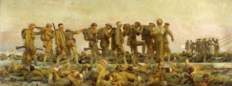
Take Gassed. The horizontal lines created by the dead and dying excoriate the human cost. The vertical lines, the people standing, high light the strength of the human spirit. They've been blinded, burned, and may be coughing up pieces of lung, but goddammit they're up and moving. The drab colors used demonstrate how gloomy the situation must have been; despite their conspicuous absence, you can imagine the landscape marred by artillery, a new implement of war. The landscape would have been devoid of foliage, shot and burned down the same as the men, all that is left would be scorched dead, writhing in pain, or trying to save those they could. The color, or lack of any color that isn't a hue of drab, makes you empathize with their misery since we as viewers cannot share it. The use of space, leaving the sky empty with no horizon other then the distant line of bodies, further emphasizes the human cost; there is no land meeting sky horizon, just dead and dying and living, backdropped by the empty drab sky. This scene of horror is a scathing representation of what humanity is capable of inflicting upon each other, and a terribly great demonstration of what a human can withstand. Too bad we've done that to each other.
The Flag
Georgia O'Keeffe
Watercolor and Graphite on Paper
San Antonio, Texas
The Flag is another example of the anxiety brought on by The War. O'Keeffe's brother was sent to France, where death and destruction were rampant; the use of gas, new artillery, aircraft, improved small arms. He did not expect to return. His deployment was hard on her. She was depressed and had to take a leave of absence from work in 1918, when she painted this piece. She makes complete use of all the space, to either show dead emptiness or the smoke of destruction that brought the death. The slanted line of the flagpole brings our attention to the figure on the right, and to the smog on the top. Is the figure her brother? Or is it Rorchache? There are more lines from the figure's head up and left, maybe cables? Crashing airplane smoke trails? If it's the latter it jives better with the doom and gloom. The colors, bruised smoke clashes with the bloody red flag. Why bloody red you might ask? She was not enthused about the US involvement in The War. We are fairly isolated, bordering only two countries. Her sentiment wasn't popular, though not unheard of. She went so far as to ask a local shop in the town she was teaching before her sabbatical to take down merchandise of an anti German nature. She didn't think much good would come of the inevitable high body count that would likely include her sibling.
The above pieces share a common trait; they speak of the dismay and cost of war, the depth of depravity to which humanity can sink. Even in persecution of evil, evil was committed, of that there can be no doubt. That's not so say we should allow it, but we must be aware of the cost we bear. For evil doesn't fear that which cannot fight it, to beat the monsters we must be monstrous ourselves, but we must use it with care lest we fuel the devil.
Poster Smash the Hun
Edward Hopper, 1918
Brooklyn, New York
If the previous pieces could be considered anti WWI because of the human cost, this one is pro war in pursuit of the extinguishment of that which is supposed as evil; The Hun. Hopper sketched this of a "big Irishman" (Teacher Curator, 2022) in the Brooklyn Shipyards swinging a maul. Though somewhat drab, the use of colors and contrast here are still harsh. Hopper was a noted realist of his time, though is isn't photographic it does have aspects of realism; the tones of color make for shadows and light from a central source. The texture of worker's pants, vest, and apron show the simple yet tough woolen cloth of the time for his position. You can see the ripples of his pants, apron, and shirt, the cap covering what is undoubtedly a sweaty brow drenched from the heavy task at hand, and the cap also shades his surely weary eyes. The lines of the painting, his pants, the bayonets, the hammer shaft, all direct our attention to his thorax, where the big heart of America's productive power must beat. They were tough men, that got us through bad times.
The Big One certainly had an affect on art. It was a cost felt around the world, even by those detached indigenous that didn't actually fight in it because it brought the rest of the world that much closer to their shores. I cannot say that the United States' involvement was unjust, but being a child of today I can only feel dubious about foreign entanglements. With the benefit of hindsight, I reckon winning WWI was the right thing to do, though it cost every participant and their loved ones dearly. And sadly, the treatment of The Hun afterward would only result in the rise of Hitler and the spark of the Second Great War.
Pennsylvania Academy of Fine Art. (2014, November 3). World War I and American art: PAFA - Pennsylvania Academy of the fine arts. World War I and American Art. https://www.pafa.org/museum/exhibitions/world-war-i-american-art
Wikimedia Foundation. (2023, June 19). Gassed (painting). Wikipedia. https://en.wikipedia.org/wiki/Gassed_(painting)
Admin. (2022, October 27). Smash the hun. Teacher Curator. https://www.teachercurator.com/20th-century-art/smash-the-hun/


All the pieces you chose are very impactful. My favorite is The Flag by Georgia O'Keeffe. It represents a voice that was silenced in the time. She makes use of the patriotic colors but uses them in an astonishing way. The blue is dark, heavy, and all consuming, the red is bleeding into the darkness, while the white contrasts the figure at the bottom of the flag pole slowly being swept away as well. The lack of stars in the night sky or on the flag paints a bleak picture indeed.
ReplyDeleteTemple your art blog appeals to me because I also talked about the First Great War. The time during this period was hard on all people and you do a great job describing it. I like the first painting because of how it shows solider leaning on everyone. The second painting shows the great color and the emptiness or smoke that brought death. The third one made me think of how hard everyone is fighting in the First Great War. Overall i am very appealed to this other part of WW1. I only thought of the soldiers and stuff and i didn't think of the people behind the scenes.
ReplyDelete